Integrating IEPs into Google Classroom



CONTEXT
What is League of Legends?
League of Legends is a 5v5 multiplayer online battle arena (MOBA) game where players choose from a large roster of unique champions, each with their own abilities and playstyles. Players work together as a team to defeat their opponents and destroy their Nexus.
ROLE
Product Designer
TEAM
Just me :)
TIMELINE
May 2026 - June 2026
TOOLS
Figma
Figma
THE PROBLEM
The core tension
As League of Legends continues to add new champions and deepen its gameplay systems, the number of choices players face during Champion Select can feel overwhelming, especially for newer players. Players must consider their own champion preferences while also understanding how their choice fits into their team’s overall composition.
USER RESEARCH
How are educators currently managing students with IEPs?
I conducted 5 interviews with daily League of Legends players to understand how they choose a champion during Champion Select and what information influences their decision. I focused on how players evaluate their team composition, identify what their team may be missing, and navigate the large number of champion choices available to them.
Across our research, three consistent challenges emerged:
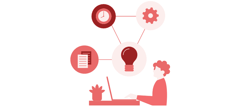
Many IEPs are overly complex or poorly structured, making it hard for teachers to quickly extract actionable accommodations.

Educators rely on manual or disconnected tools, leading to inconsistent tracking and increased administrative burden.
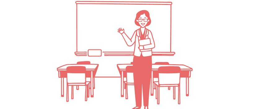
Teachers manage a mix of IEP and non-IEP students, often collaborating with rotating staff, which complicates consistency in accommodations.
The insight that reframed everything
During our site visit, we watched a teacher pause mid-lesson to flip through a printed IEP binder to recall a student's extended time accommodation during an assignment handout. The IEP wasn't the problem. The distance between the IEP and the moment of action was.
This single observation reframed our HMW from "how do we make IEPs more accessible?" to "how do we collapse the distance between IEP knowledge and classroom action?"
How do we collapse the distance between IEP knowledge and classroom action?
Design Principle: Zero new surfaces
Early concepts included a standalone IEP dashboard, a logical solution that I deliberately rejected. A separate tool would require teachers to context-switch, exactly the behavior causing the current breakdown. Instead, I mapped the three highest-friction moments in a teacher's existing Google Classroom workflow and embedded IEP support at each one:
Scope Definition
While some IEP accommodations require in-person support, I focused on opportunities that could be meaningfully improved within a digital platform like Google Classroom.
IDEATION
Exploring key features to address the complexities of IEP integration
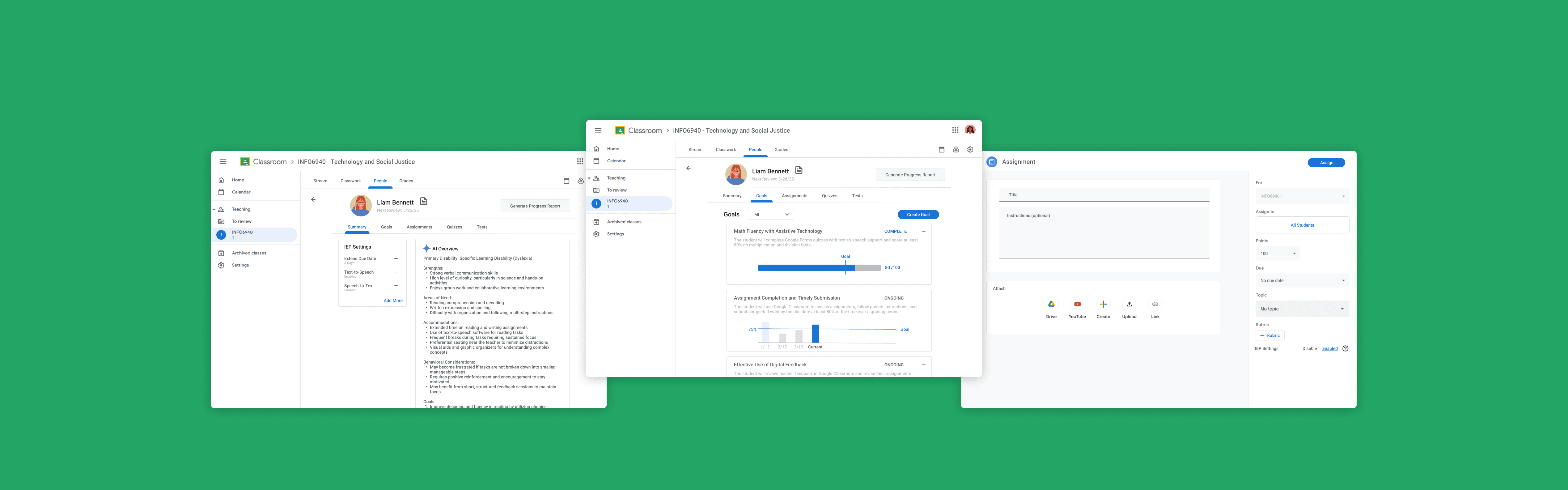
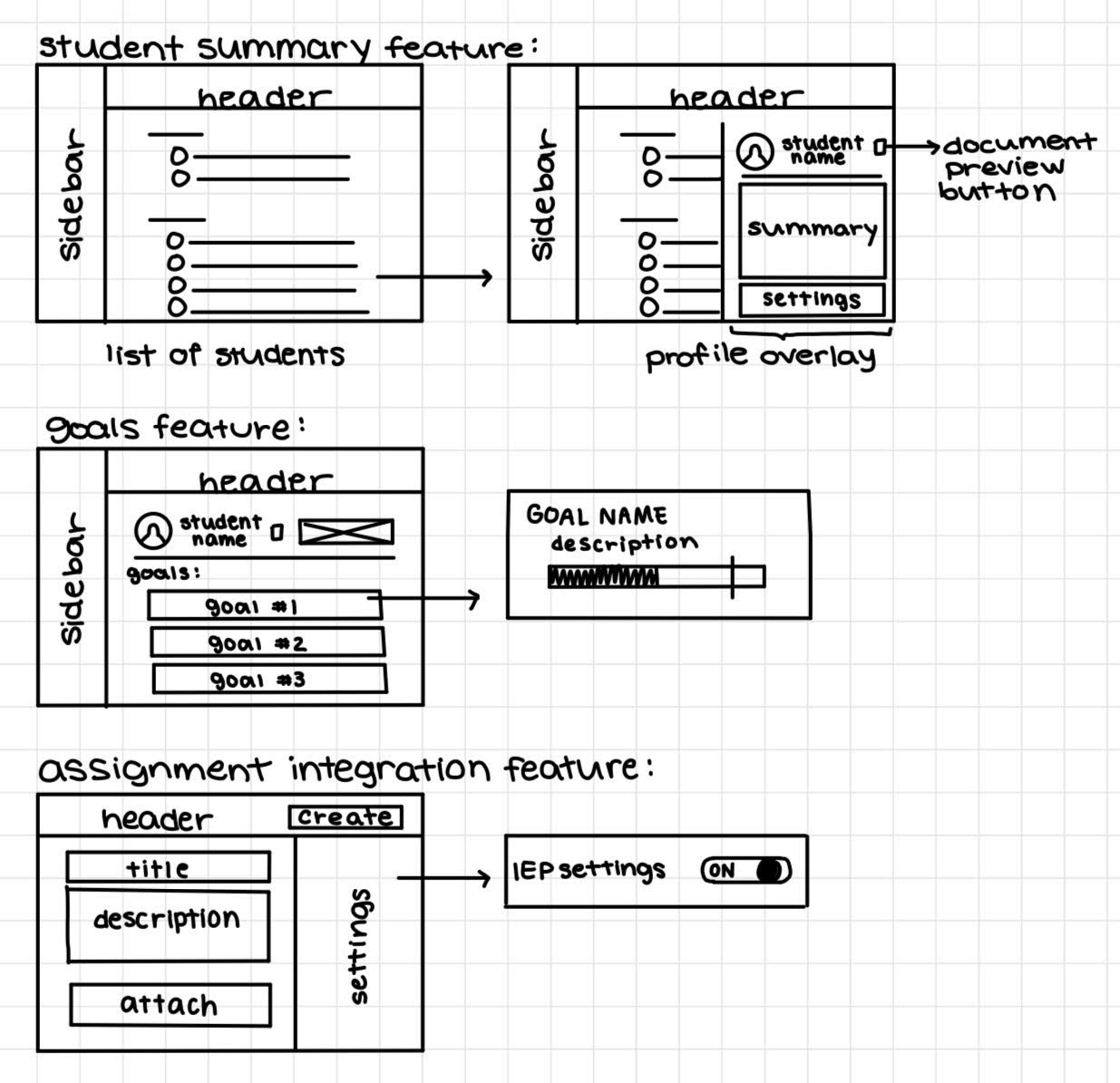
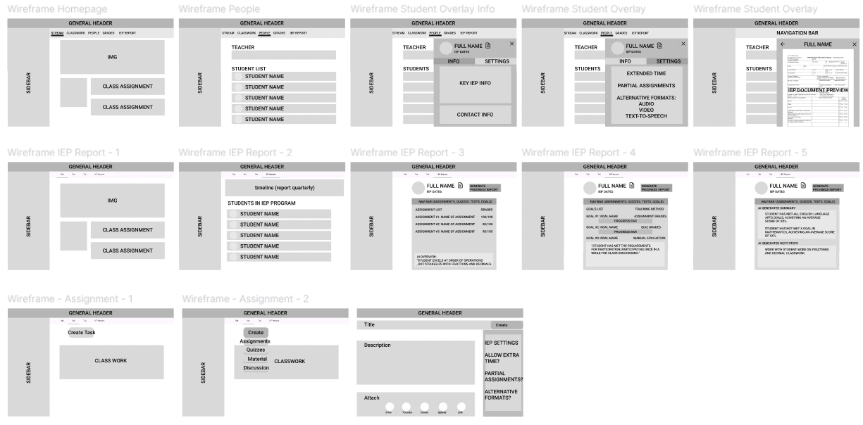
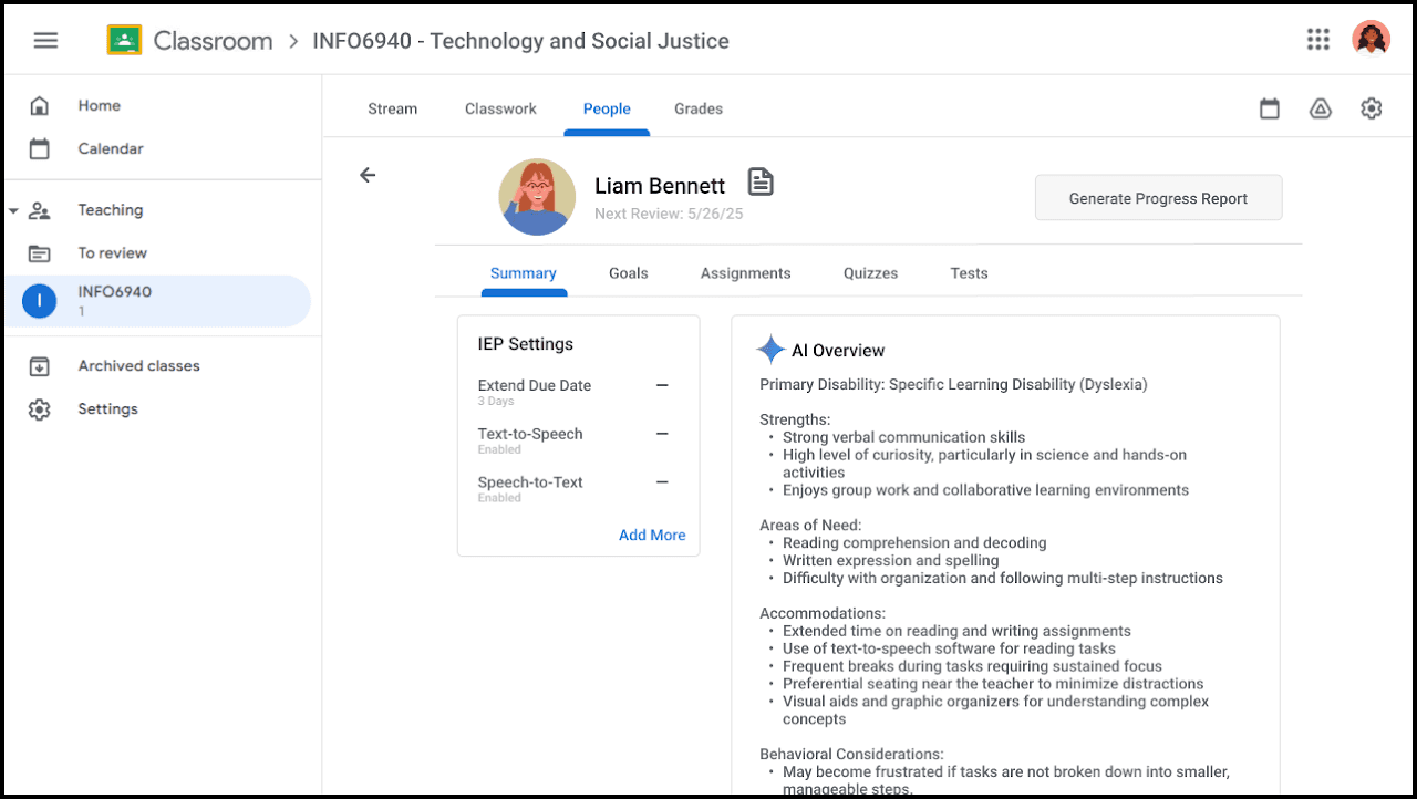
I created low-fidelity sketches and medium-fidelity wireframes to consolidate our potential ideas and envision the core features of the application. These included the Student Summary Page, a Goals Page, and an Assignment Integration Page.
To ensure cohesion, I followed existing design patterns from Google Classroom, aligning with its UI structure and interaction models.
ITERATIONS
From Fragmentation → Centralization
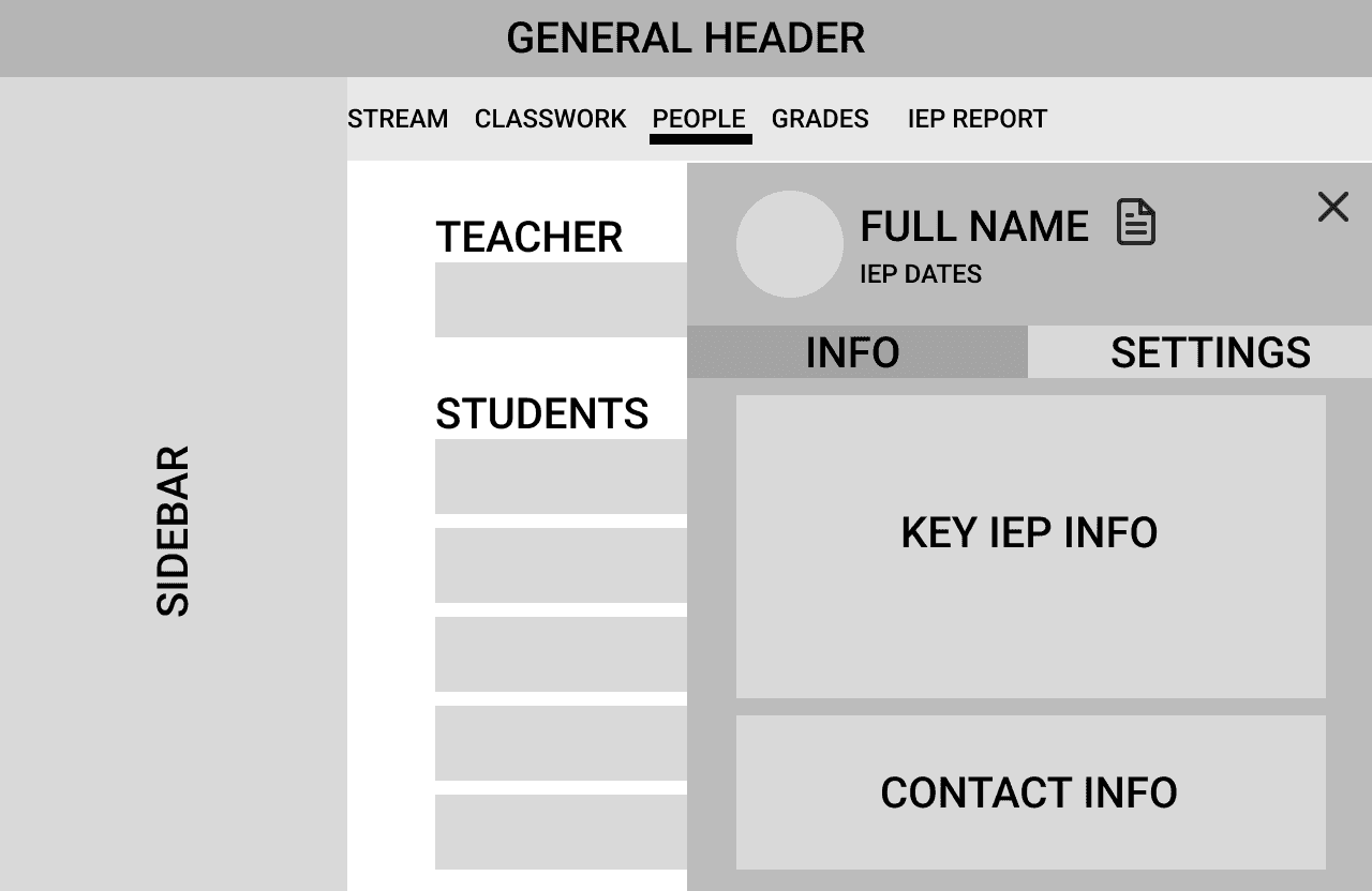
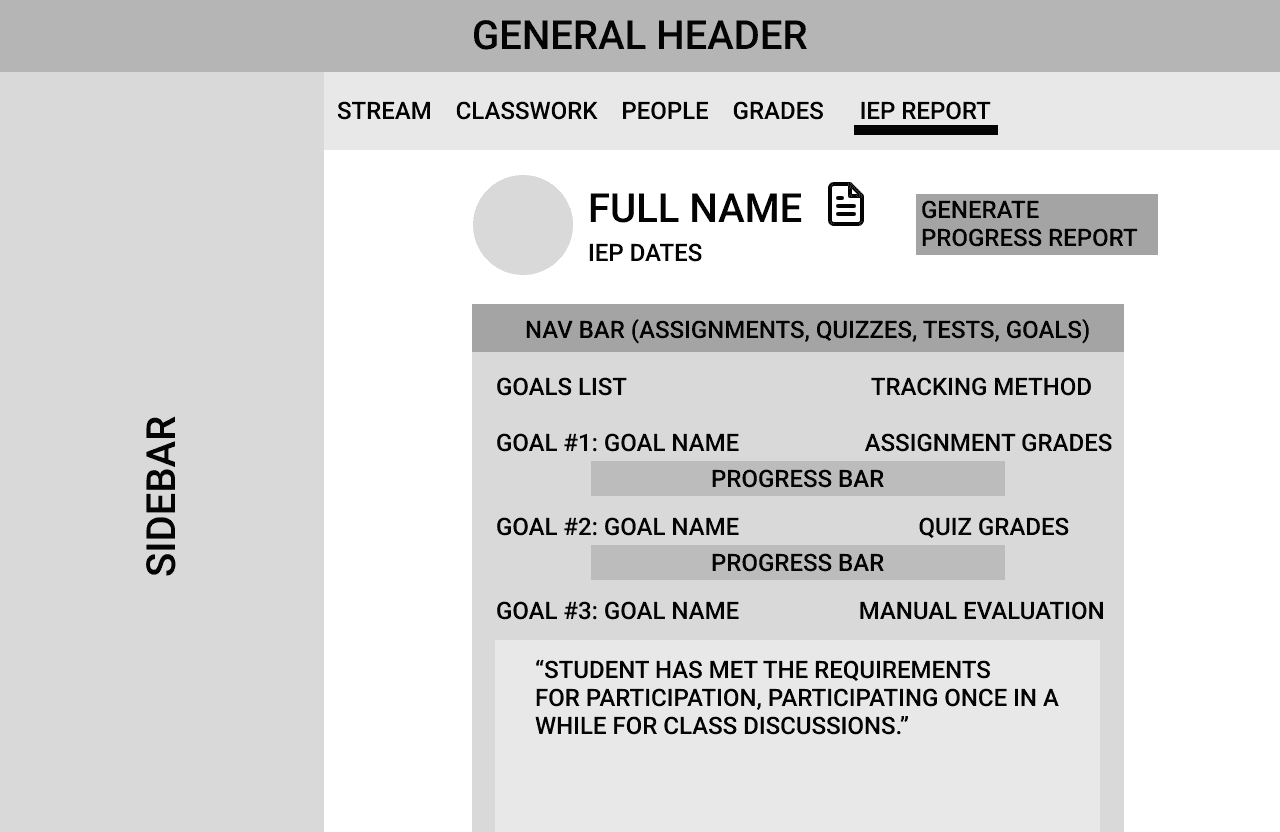
Moving from wireframes to prototypes, the overall format stayed consistent, but a key change was the placement of IEP information. In the initial approach, IEP features were distributed across multiple sections of the platform: summaries were placed under “People,” goals were located under “Grades,” and additional data existed in a separate tab. This fragmented structure increased cognitive load and made it harder for educators to quickly access the information they needed.
To address this, I made a final design decision to consolidate all IEP-related information into a unified student profile that could be accessed from multiple entry points. This shift reduced navigation complexity, better aligned with teachers’ mental model of thinking student-first rather than feature-first, and improved efficiency when switching between different classroom contexts.
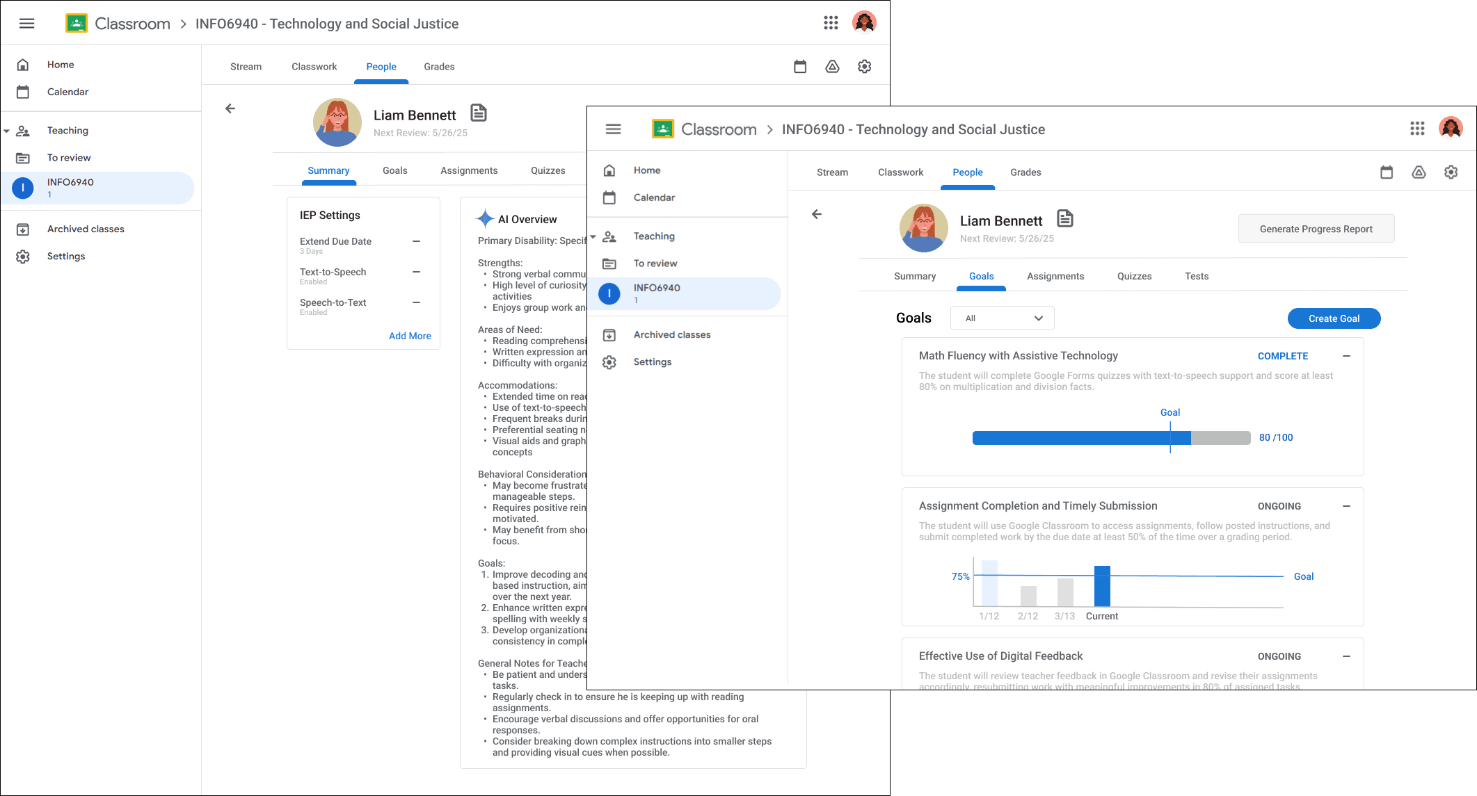
Goals Iterations
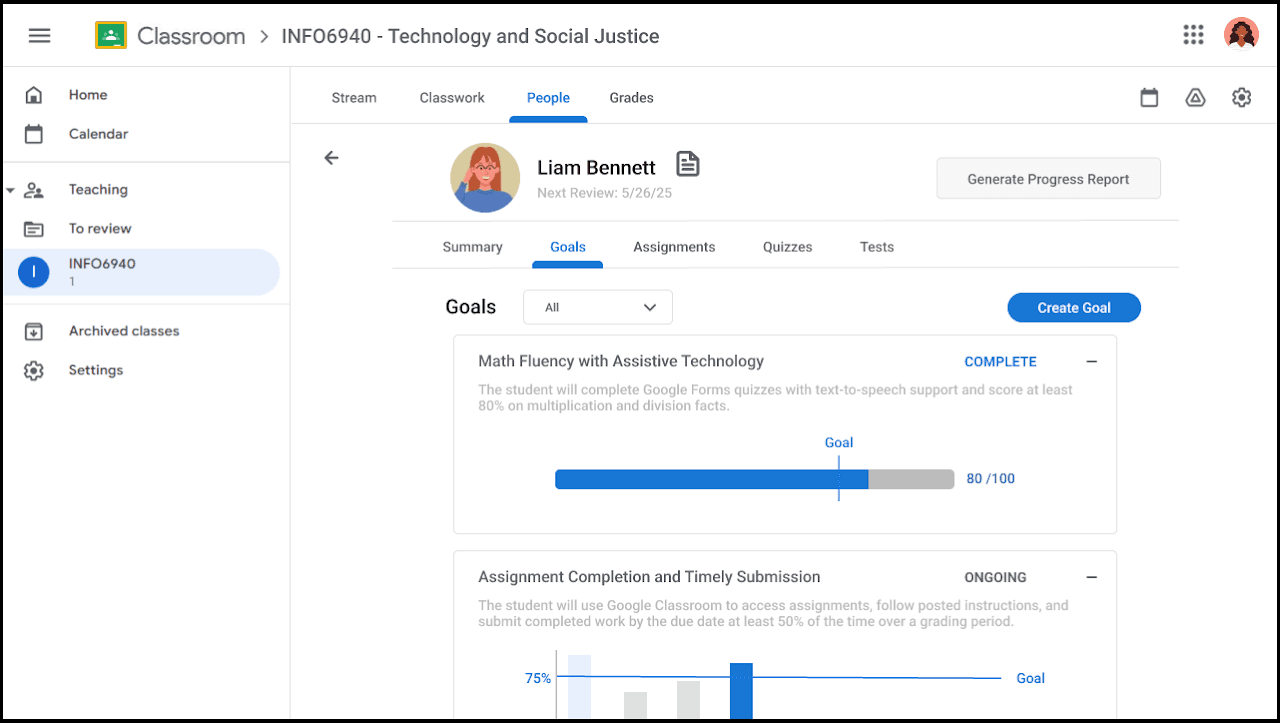
When iterating on how I wanted the goals to be displayed, I focused on making the design easy to understand and intuitive to grasp at a glance. I explored multiple layouts to improve clarity and scannability:

Option 1: Minimal View
✅
Easy to scan fast
❌
Can't see the specifics of the goal since theres no description.
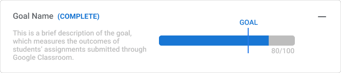
Option 2: Side-by-Side
✅
Description provides context for what the progress bar represents.
❌
Description feels cluttered and hard to read.
❌
Progress bar is horizontally shrunk to have space for description.
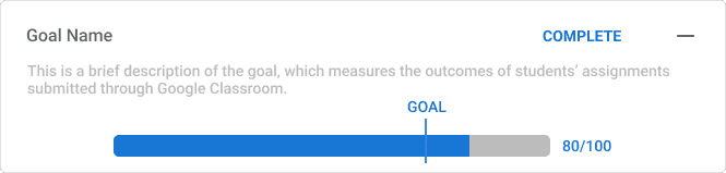
Option 3: Context-First Layout
✅
Clear hierarchy, as users will read the context first before interpreting the bar.
✅
Cleaner visual flow.
✅
No space competition
Option 3 was validated not just visually, but behaviorally. In the side-by-side layout (Option 2), users will read the progress bar before the description, then had to re-read to understand what it measured. Option 3 enforces the correct reading order: context before interpretation. This matters in high-stakes environments where a misread progress bar could mean a teacher incorrectly believes a student has met a goal they haven't.
Assignments Iteration
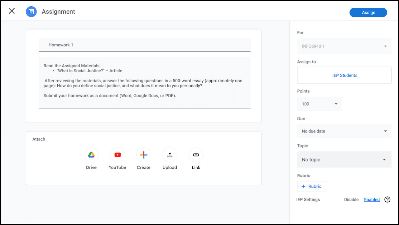
I also explored ways to apply accommodations during assignment creation:
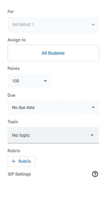
Option 1: Check-box
✅
Simple Toggle
⚠️
It takes up minimal space until there are more options
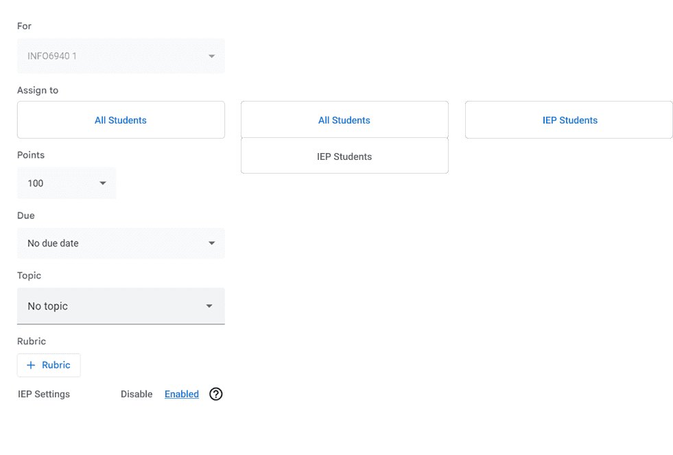
Option 2: Collapsible Button
✅
The user can see all the available specialized settings at a glance once they expand the section, which could be more intuitive than a single toggle.
✅
More scalable
❌
It adds an extra click for the user to get to the settings.
Option 2 was selected because it allows me to present detailed IEP settings without cluttering the main assignment creation page. It’s a more scalable solution that supports multiple types of settings, offering greater clarity and control than a simple checkbox.
FINAL DESIGNS
IEP Overview Summaries

Goals Tracking and Progress

Assignment Integration

CONCLUSION & TAKEAWAYS
Turning Research into Practical, Impactful Design
This project shifted my approach from designing standalone features to thinking in systems and workflows. I learned that effective solutions are not about adding more tools, but about embedding support into existing behaviors in a way that reduces friction and cognitive load. It also reinforced the importance of: designing within real constraints, prioritizing based on user behavior, and making intentional tradeoffs between simplicity and flexibility.
Next Steps
I'd prototype an AI-assisted IEP summarization layer, not to replace human judgment, but to reduce the time a special ed coordinator spends translating a 25-page document into a 5-bullet teacher brief. This sits at the intersection of Workspace AI investment and special education equity, two areas where Google has both capability and incentive.