SecretSanta: Let the Gift of Giving Begin


CONTEXT
What is SecretSanta?
SecretSanta is an app that simplifies anonymous gift exchanges among friends. It handles everything from drawing names to managing wish lists, with features like random matching, private wish list sharing, and deadline reminders, making the process easy and fun.
ROLE
Product Designer
TEAM
Solo
TIMELINE
October 2024 -December 2024
TOOLS
Figma
Google Workspace
THE PROBLEM
How can we simplify secret santa planning?
Organizing Secret Santa can be tricky with issues like name drawing, anonymity, wish lists, and deadlines. Email threads and group chats often cause confusion. A simple, centralized platform is needed to manage everything while keeping the fun intact.
Task: To create SecretSanta, an intuitive app that simplifies the entire Secret Santa process by automating name drawing, sharing wish lists privately, and setting deadline allowing friends to focus on the joy of giving and receiving gifts.
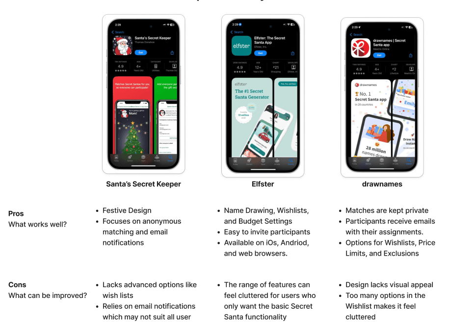
COMPETITIVE ANALYSIS
Opportunities for improvement
My competitive analysis revealed the importance of simplicity and core features like name drawing and wishlists, with an opportunity to boost engagement through added social features.
USER RESEARCH
Exploring secret santa experiences
My research plan focused on understanding how people organize Secret Santa exchanges, the challenges they face, and the tools or methods they’ve used. I aimed to evaluate what works well and where opportunities exist to simplify and improve the experience. After conducting 5 user interviews, here's what I learned:
DEFINE
How can we prioritize user needs?
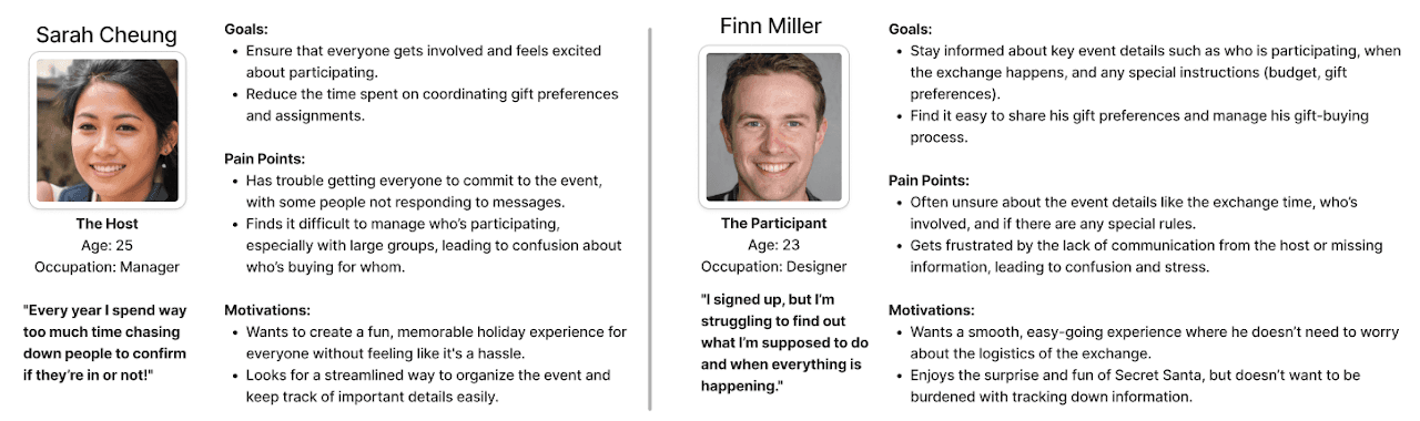
In analyzing user research, I created two user personas, one for the host and one for the participant, that captured key needs, goals, and pain points, including difficulties with securing commitments and communicating effectively.
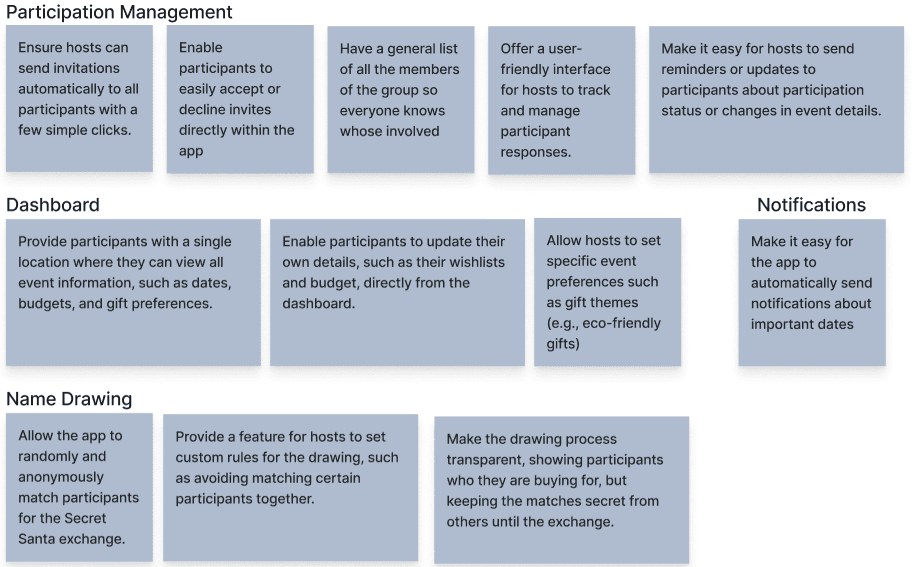
As part of my project goals, I proposed solutions like a centralized dashboard, automatic name drawing, and customizable gift preferences to improve coordination and event participation.
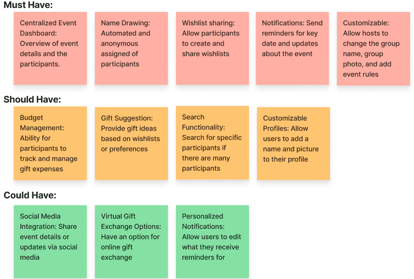
As part of my feature roadmap, I prioritized features by impact, grouping them into "must," "should," and "could haves", with top priorities including the event dashboard, name drawing, and wishlist sharing.
IDEATE
Emphasizing real-time group creation and wishlists
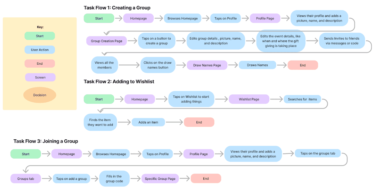
My task flow maps a student's journey through the app, from exploring the homepage, to creating or joining a group, then to adding to their wishlist.
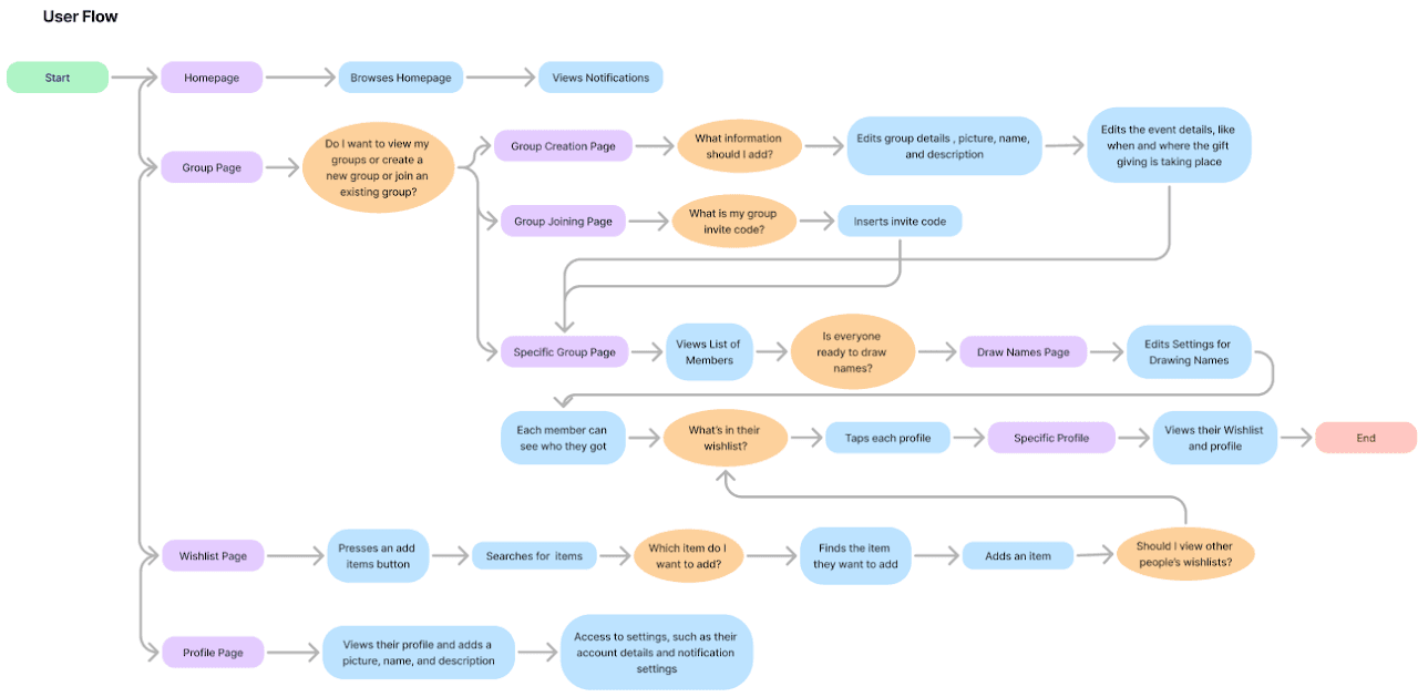
My user flow maps user decisions and motivations, showing how they navigate from the homepage through actions like creating groups or viewing wishlists, highlighting key engagement points and pathways.
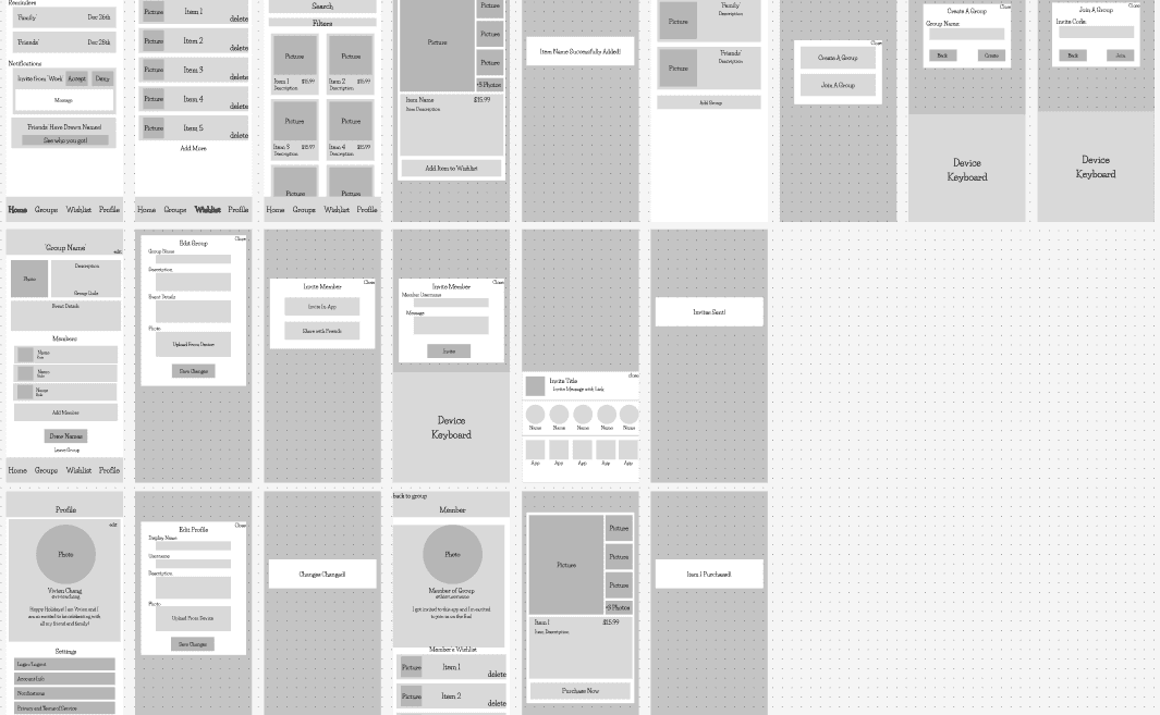
After defining the task flows and user journeys, I designed a medium-fidelity wireframe focused on creating a clean, intuitive interface that guides users through key actions such as adding items, browsing products, and managing groups while minimizing the clutter commonly found in similar apps.
ITERATIONS
Refining the secret santa experience
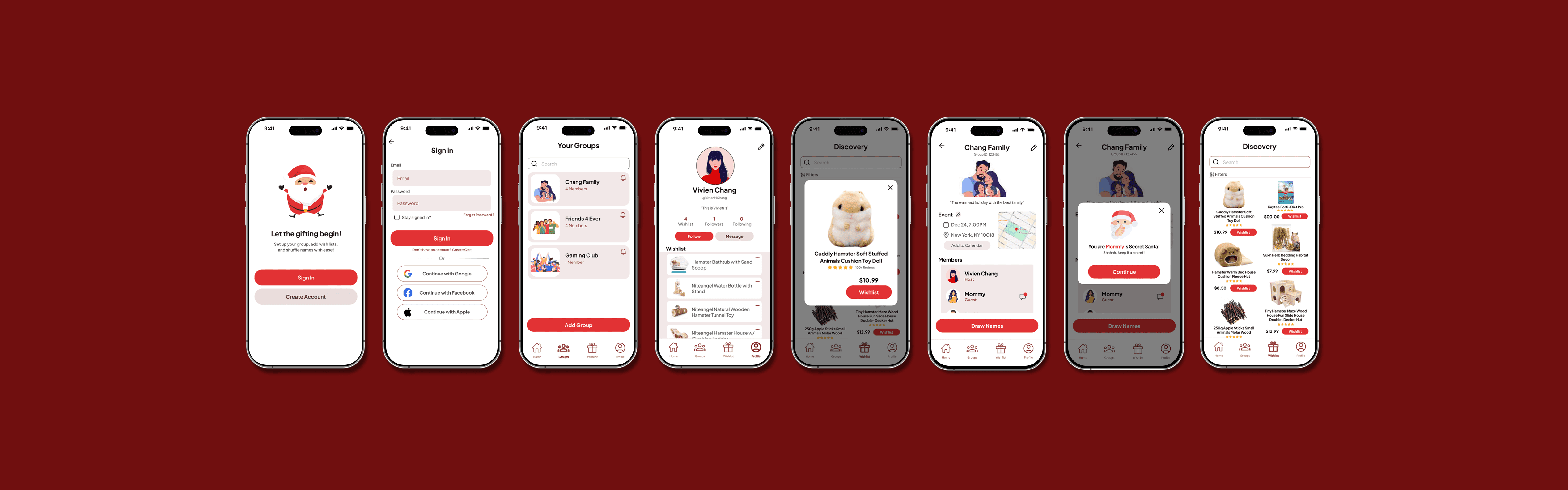
My high-fidelity prototype provided a seamless mobile experience, beginning with a simple homepage that displays any notifications for any of their groups. It then guided users through the basic navigation of group creation and inviting members.
To improve this prototype further, I conducted three user testing sessions, which led me to these main revisions:
Revision 1: A Splash of Modernity
Users felt the design was outdated, citing a dull color scheme that lacked vibrancy and clear visual hierarchy.
Revision: I refreshed the color palette by introducing a bright red as the primary accent color for buttons, giving the design a bold and modern touch. To complement the bright red, I incorporated lighter shades of red, pink, gray, and white for secondary elements and background sections, creating a cohesive and visually engaging interface.
Before
After
Revision 2: Embracing White Space
Users felt the interface was overly crowded, making it visually overwhelming and difficult to navigate. Although the functionality remained intact, the dense use of rectangles contributed to a cluttered appearance.
Revision: I incorporated more white space between sections, creating a more open and breathable layout. This update enhanced clarity, reduced visual clutter, and aligned the design with modern, user-friendly interface
Before
After
Revision 3: From Sharp to Soft
Users found the hard edges in the previous design uninviting and overly rigid.
Revision: I introduced softer, rounded edges to all shapes, creating a more approachable and modern aesthetic. To improve usability, I simplified and separated the content to different screens, ensuring that only the most relevant information is displayed, resulting in a cleaner and more focused interface.
Before
After
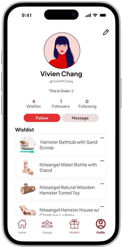
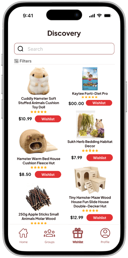
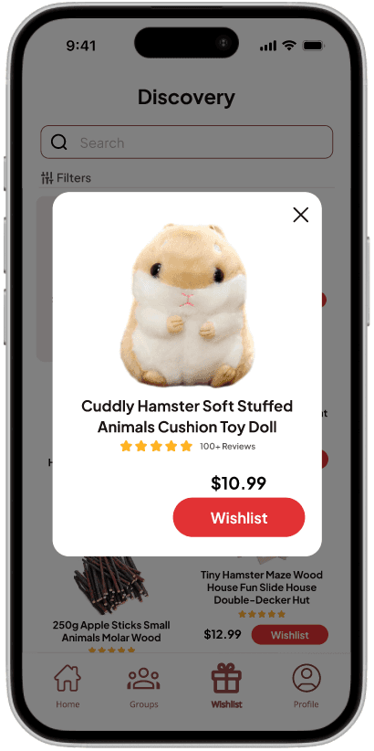
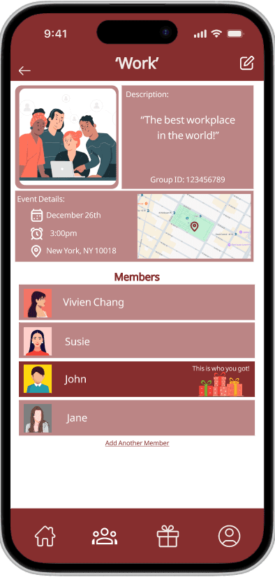
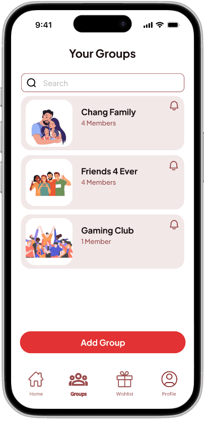
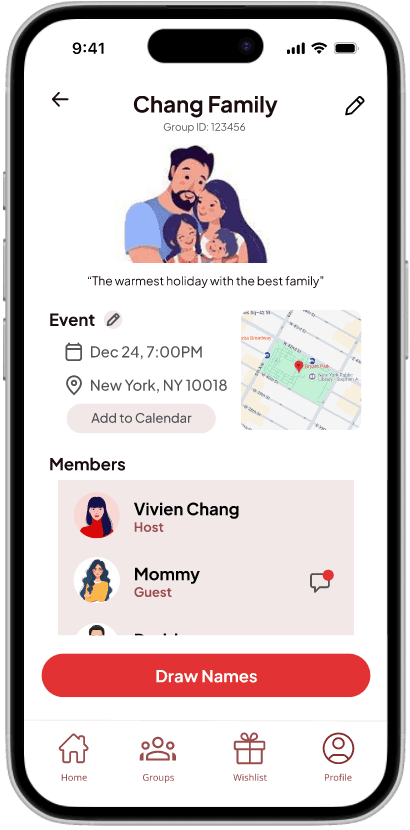
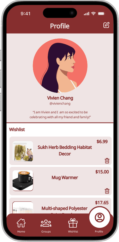
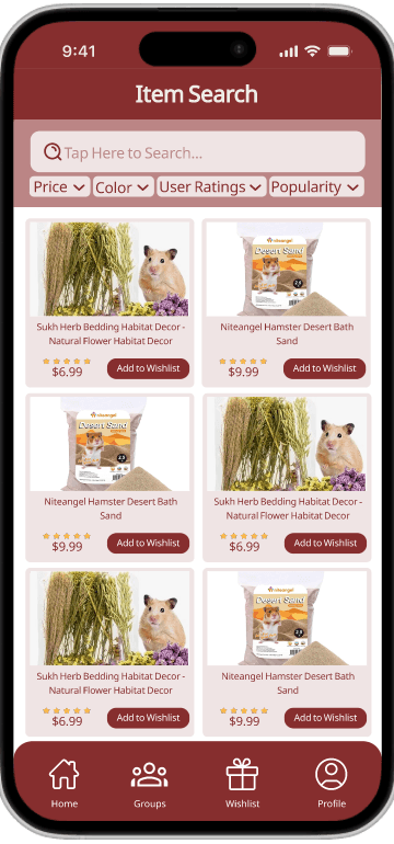
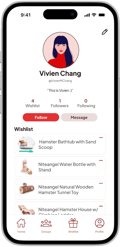
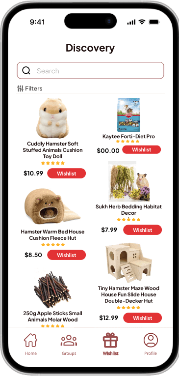
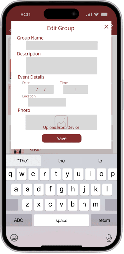
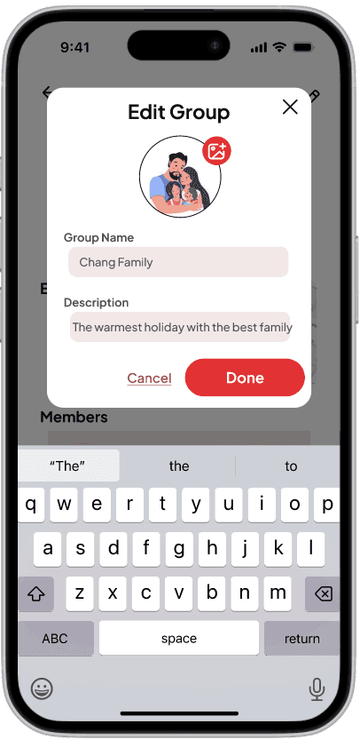
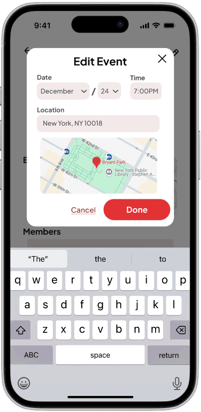
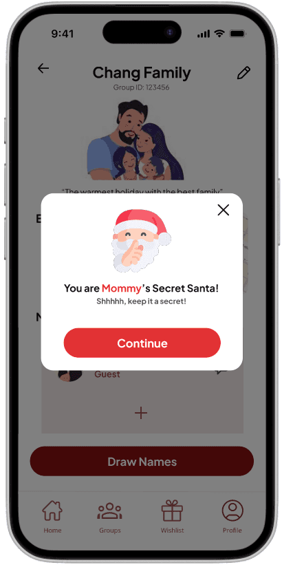
FINAL DESIGNS
Creating a Group + Inviting Friends

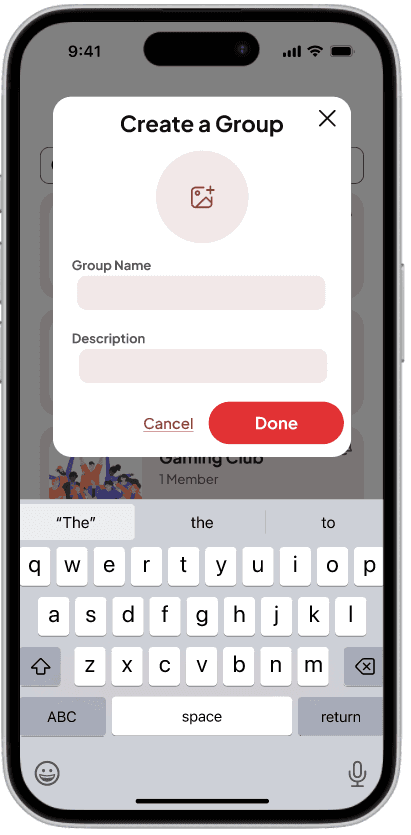
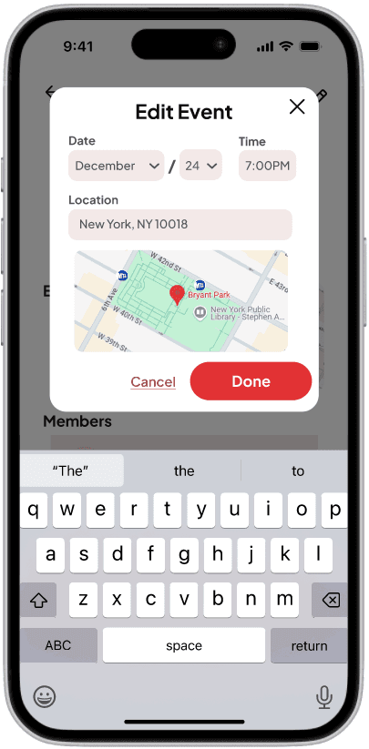
Creating a Group + Inviting Friends


Wishlisting